So, you have a beautifully designed website that perfectly represents your brand. However, do you have an equally effective business card? Remember, the business card is the face of the company. It is a representative of the business.
Even in this digital age, professional business cards continue to be incredible for networking and securing new clients for your business. You have to make wise design choices to ensure business cards grab the attention of your clients.
So, here are a few do’s and don’ts of business cards.
Do’s
- Do Choose a Professional Design
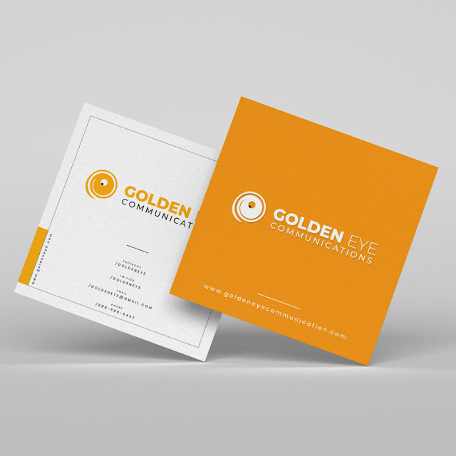
The design for business card printing has to be consistent with the design of the other printed materials. Do not simply choose a generic design for your luxury business cards if you have to stand out from your crowd. You can take the help of a professional designer to design that business card for you. It will help in creating a professional image.
- Do Focus on Readability
It is a pointer that is primarily applicable to fonts. Sure, it can be tempting to include a new or decorative font but they might be difficult to read. One of the primary things that you should focus on when you are printing a business card is its readability. Check the font size to ensure that they aren’t too overwhelming or big. Also, the font shouldn’t be too small for the clients to squint to read it.
- Do Choose the Layout Carefully
The standard size of a business card is 3.5x2 inches. In case you are choosing an unconventional size and design for luxury business card printing, it will stand out among other cards. However, they might be difficult to store.
A business card has two sides. You need to take advantage of the additional space simply by filling it out with the most important information.
- Do Choose the Right Color Schemes
Apart from the typeface’s legibility, the color scheme you are choosing for the business cards determines its success. Bold and bright colors can help in grabbing the attention of your potential customers.
You should keep your business in mind when you plan the color schemes and visual content. Remember, consistency is the key. Make sure you are choosing colors that will not distract your clients from the key business details or the logo.
Don’ts
- Don’t Use Random Visuals
In case you aren’t sure about the visuals you would like to use for your business, it is better you do not use any of them are not contributing in any way to inform your clients about the business or about you.
- Don’t Forget About the Bleed
Bleed is an area outside the print documents that are trimmed after it has been printed. Thus, there might not be any white space left on the document. You can have a great business card design but if you forget all about adding space to the design, you might the risk of having parts of the contact details left on the floor of the cutting room.
Don’t worry. It is easy to add. You can take the help of some handy templates.
- Don’t Use Glossy Coating Like UV
Glossy finishes might look nice but glossy finishes also come with many disadvantages. You might not have considered this while printing the business cards. However, you should know that people use them for writing notes. Also, they will have to stand there and read the card avoiding direct sunlight since the light bounces off the business card design.
- Don’t Cram It with Details
You might have a lot to inform your potential clients but adding too many details to the business card can make it look unprofessional. Excessive details on the cards can scare off your customers and drive them away. In fact, these might annoy them so much that they get ready to discard them. Hence, you should make sure that you are including only essential information, such as the brand name, logo, phone number, address, and web address.